|
Found this on JuliusBlog... an interesting correlation...
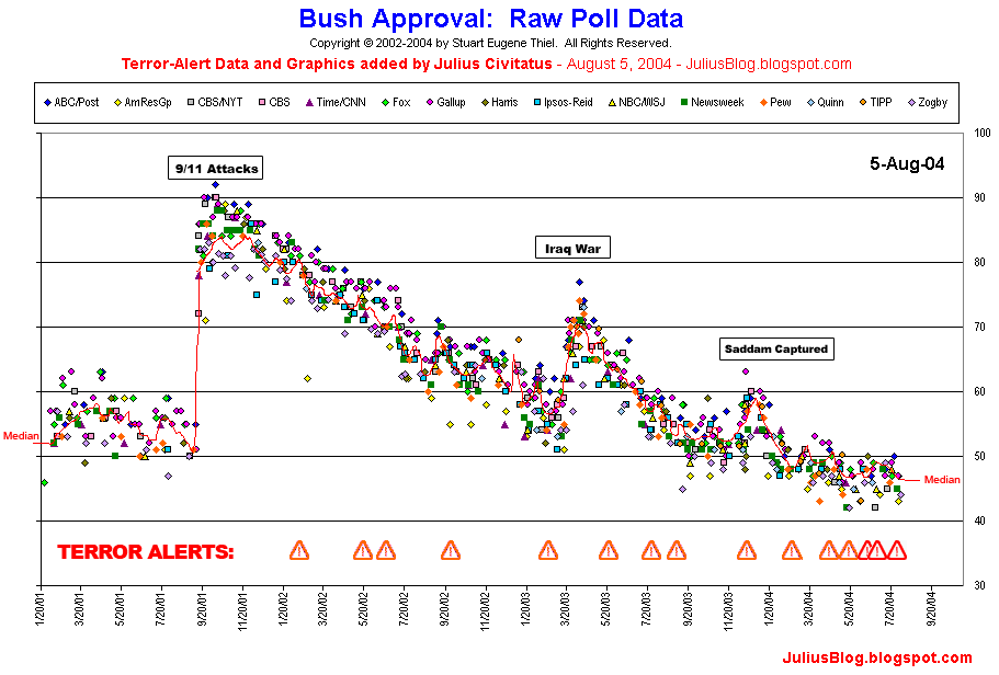
I have put together a chart comparing Bush approval numbers to the timeline of terror alerts. (Thanks to Stuart Eugene Thiel for the amazing daily graphics that he prepares, comparing the approval ratings from different polls and media sources.) You can see it by clicking in the graphic below: 
There are few things that are quite evident from the chart:
- Whenever his ratings dip, there's a new terror alert.
- Every terror alert is followed by a slight uptick of Bush approval ratings.
- Whenever there are many unfavorable headlines, there's another alert or announcement (distraction effect).
- As we approach the 2004 elections, the number and frequency of terror alerts keeps growing, to the point that they collapse in the graphic. At the same time, Bush ratings are lower than ever.
Update: for the record, we are not claiming that all these alerts are politically motivated. We are sure a considerable amount of these alerts were legit and caused by real and immediate information of potential threats. What is important to note is that many of these "immediate" terror alerts were later on discredited (in some cases they used old data, in other cases the announcements were less immediate and less urgent that we were lead to believe, as the press reported.) Those are the cases that could be interpreted as politically motivated, especially when they seemed to coincide with political news and events unfavorable to the administration. |